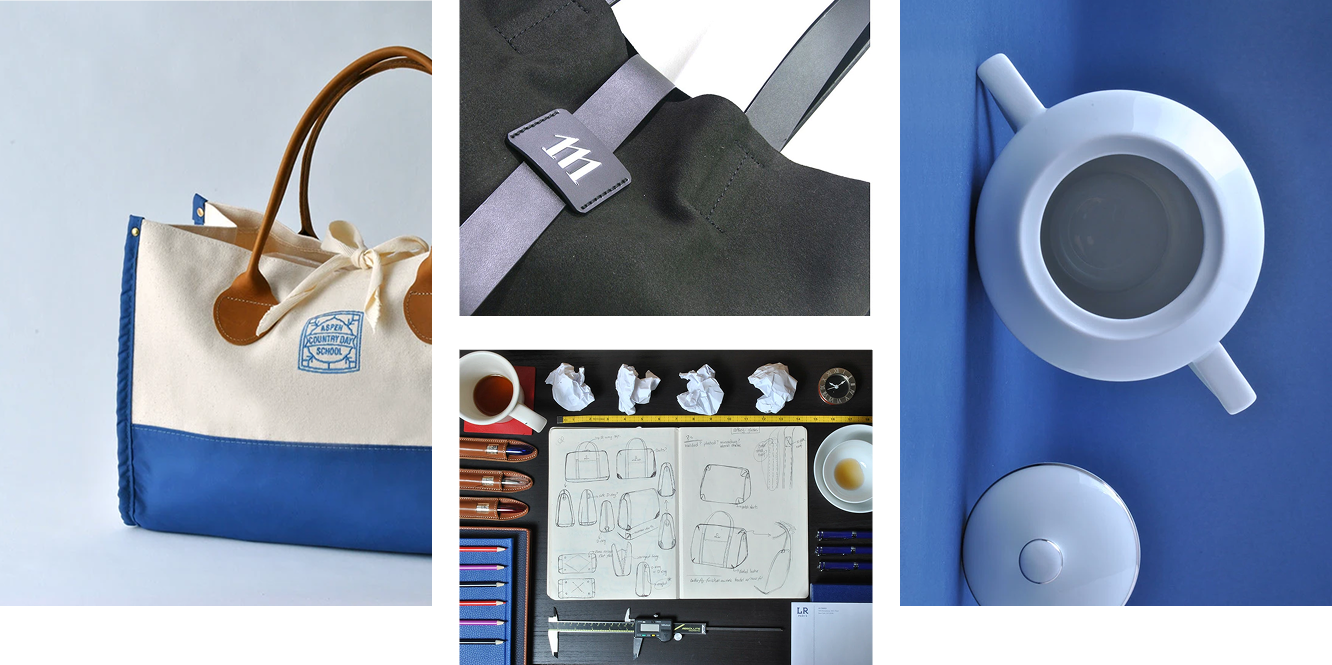
Hi! My name is Karen Lorena. I am a UX designer, and product photographer.

Hello world, I’m Karen!
Sr. Experience Designer by day, artist by heart, and a firm believer in the power of human-centered creativity.
I live at the intersection of structure and expression. With a background in Industrial Design and a Master’s in Design and Technology, my work has always been about understanding how people interact with the world—whether that’s through a digital interface or a physical object.
The Design Side
Currently, I am a Sr. Experience Designer at Concentrix Catalyst. I’ve spent my career leading design efforts for complex digital ecosystems and mission-driven products. My experience ranges from building a comprehensive design system for a major health and wellness app to an intensive eight-month redesign of an insurance agent platform. I thrive in multidisciplinary teams where I can use design systems thinking to solve complex problems, turning high-friction tasks into intuitive, elegant solutions that empower users.
The Creative Journey
While my professional world is often built in Figma, my personal world is colored with acrylics, watercolors, and digital brushes. Like many creatives, I’ve found that the best way to grow is through consistent practice and the courage to explore. Painting is where I find my flow, and I am particularly passionate about Art Therapy. I believe the act of creation is a vital tool for mental clarity and healing—a philosophy that often finds its way back into my user experience work, where empathy and well-being are at the core of every design decision.
Life in Motion
When I’m not at my desk or in front of a canvas, I’m usually finding balance in other ways:
Calisthenics: I’ve recently fallen in love with the discipline of bodyweight training, finding the same joy in mastering physical mechanics that I do in building a design system.
Robbin: My 9-month-old Border Collie (mix?), who keeps me active and reminds me every day of the importance of play and patience.
I’m always looking for new ways to bridge the gap between design and art. Whether you want to talk about UX strategy, art therapy, or the best way to train a high-energy pup, I’d love to hear from you.
Here are some samples of UX projects I’ve worked on.
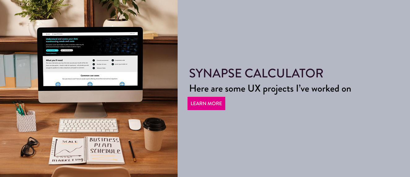
SYNAPSE CALCULATOR
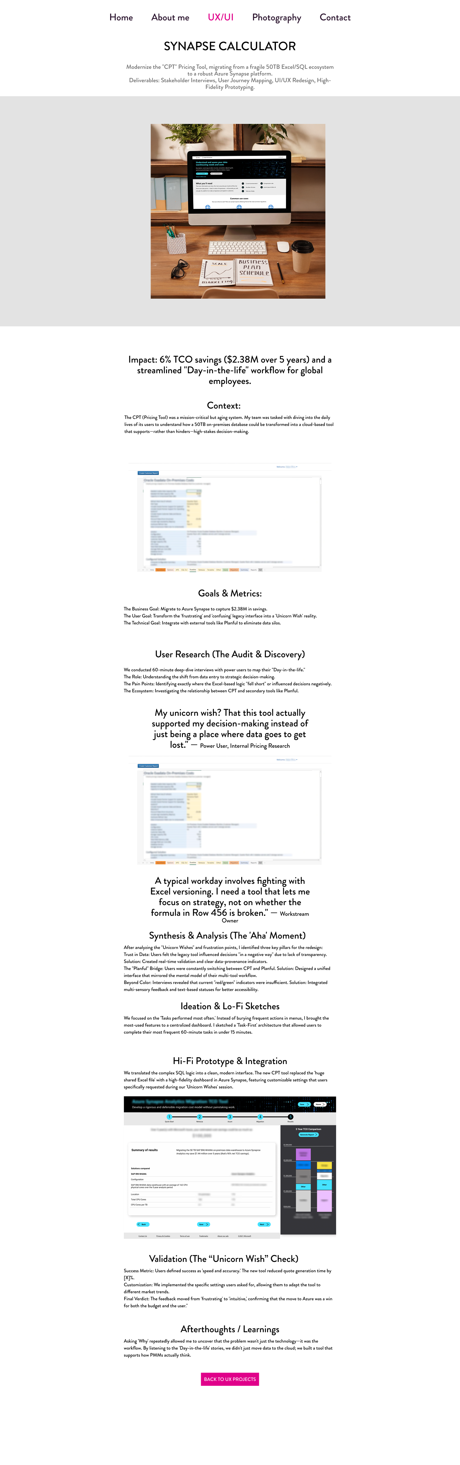
Modernize the "CPT" Pricing Tool, migrating from a fragile 50TB Excel/SQL ecosystem to a robust Azure Synapse platform.
Deliverables: Stakeholder Interviews, User Journey Mapping, UI/UX Redesign, High-Fidelity Prototyping.
Context:
The CPT (Pricing Tool) was a mission-critical but aging system. My team was tasked with diving into the daily lives of its users to understand how a 50TB on-premises database could be transformed into a cloud-based tool that supports—rather than hinders—high-stakes decision-making.
Goals & Metrics:
- The Business Goal: Migrate to Azure Synapse to capture $2.38M in savings.
- The User Goal: Transform the 'frustrating' and 'confusing' legacy interface into a 'Unicorn Wish' reality.
- The Technical Goal: Integrate with external tools like Planful to eliminate data silos.
User Research (The Audit & Discovery)
We conducted 60-minute deep-dive interviews with power users to map their "Day-in-the-life."
- The Role: Understanding the shift from data entry to strategic decision-making.
- The Pain Points: Identifying exactly where the Excel-based logic "fell short" or influenced decisions negatively.
- The Ecosystem: Investigating the relationship between CPT and secondary tools like Planful.
"My unicorn wish? That this tool actually supported my decision-making instead of just being a place where data goes to get lost."
"A typical workday involves fighting with Excel versioning. I need a tool that lets me focus on strategy, not on whether the formula in Row 456 is broken."
Synthesis & Analysis (The 'Aha' Moment)
After analyzing the "Unicorn Wishes" and frustration points, I identified three key pillars for the redesign:
- Trust in Data: Users felt the legacy tool influenced decisions "in a negative way" due to lack of transparency. Solution: Created real-time validation and clear data-provenance indicators.
- The "Planful" Bridge: Users were constantly switching between CPT and Planful. Solution: Designed a unified interface that mirrored the mental model of their multi-tool workflow.
- Beyond Color: Interviews revealed that current "red/green" indicators were insufficient. Solution: Integrated multi-sensory feedback and text-based statuses for better accessibility.
Ideation & Lo-Fi Sketches
We focused on the Tasks performed most often: Instead of burying frequent actions in menus, I brought the most-used features to a centralized dashboard. I sketched a 'Task-First' architecture that allowed users to complete their most frequent 60-minute tasks in under 15 minutes.
Hi-Fi Prototype & Integration
We translated the complex SQL logic into a clean, modern interface. The new CPT tool replaced the 'huge shared Excel file' with a high-fidelity dashboard in Azure Synapse, featuring customizable settings that users specifically requested during our 'Unicorn Wishes' session.
Validation (The "Unicorn Wish" Check)
- Success Metric: Users defined success as 'speed and accuracy'. The new tool reduced quote generation time significantly.
- Customization: We implemented the specific settings users asked for, allowing them to adapt the tool to different market trends.
- Final Verdict: The feedback moved from 'frustrating' to 'intuitive', confirming that the move to Azure was a win for both the budget and the user.
Afterthoughts / Learnings
Asking 'Why' repeatedly allowed me to uncover that the problem wasn't just the technology—it was the workflow. By listening to the 'Day-in-the-life' stories, we didn't just move data to the cloud; we built a tool that supports how PMMs actually think.
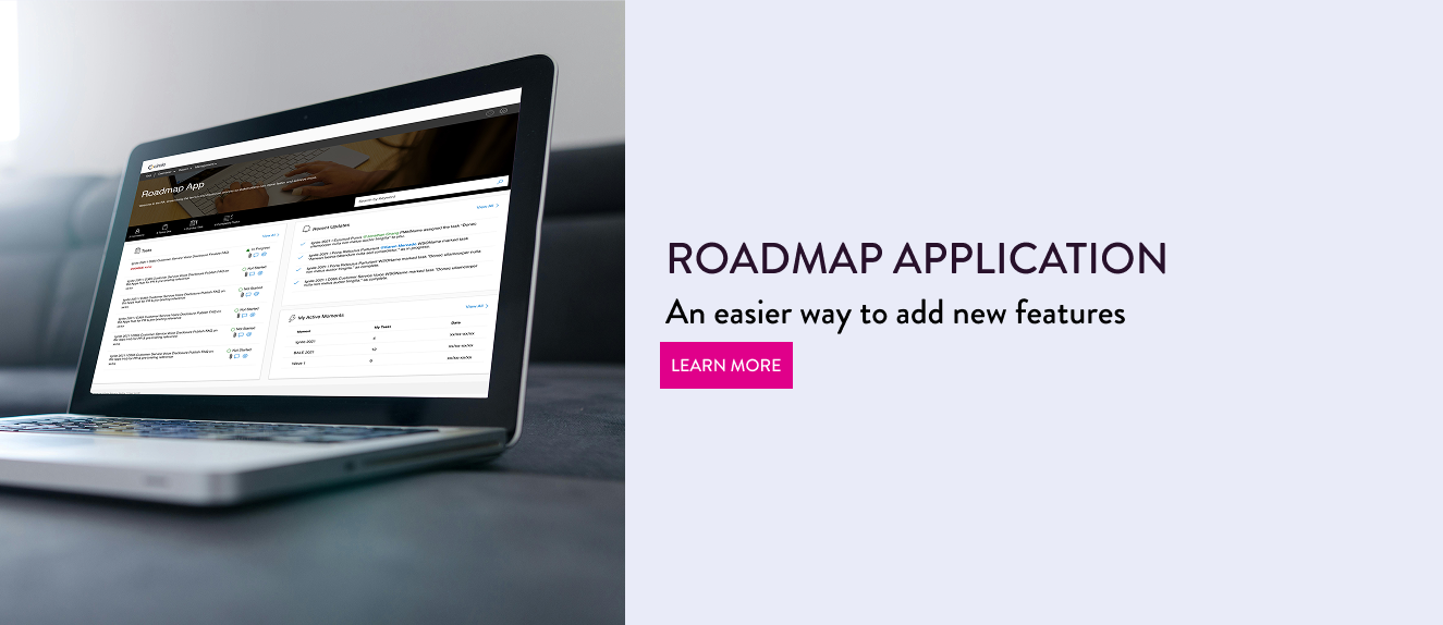
ROADMAP APPLICATION
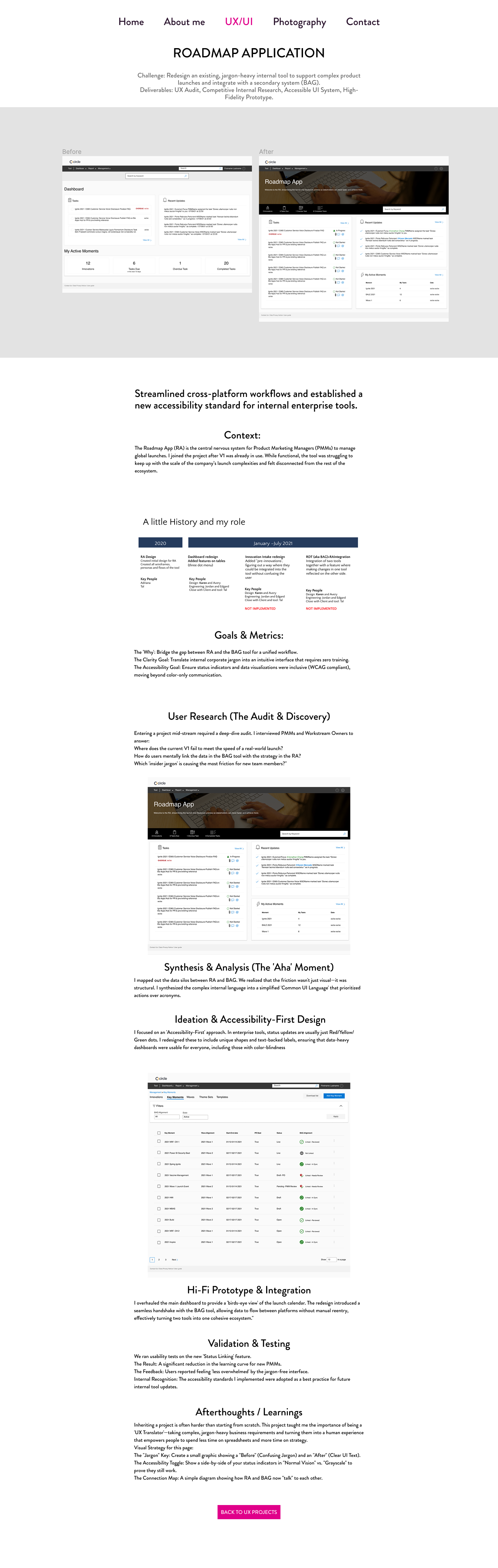
Redesign an existing, jargon-heavy internal tool to support complex product launches and integrate with a secondary system (BAG).
Deliverables: UX Audit, Competitive Internal Research, Accessible UI System, High-Fidelity Prototype.
Context:
The Roadmap App (RA) is the central nervous system for Product Marketing Managers (PMMs) to manage global launches. I joined the project after V1 was already in use. While functional, the tool was struggling to keep up with the scale of the company's launch complexities and felt disconnected from the rest of the ecosystem.
Goals & Metrics:
- The 'Why': Bridge the gap between RA and the BAG tool for a unified workflow.
- The Clarity Goal: Translate internal corporate jargon into an intuitive interface that requires zero training.
- The Accessibility Goal: Ensure status indicators and data visualizations were inclusive (WCAG compliant), moving beyond color-only communication.
User Research (The Audit & Discovery)
Entering a project mid-stream required a deep-dive audit. I interviewed PMMs and Workstream Owners to answer:
- Where does the current V1 fail to meet the speed of a real-world launch?
- How do users mentally link the data in the BAG tool with the strategy in the RA?
- Which 'insider jargon' is causing the most friction for new team members?
Synthesis & Analysis (The 'Aha' Moment)
I mapped out the data silos between RA and BAG. We realized that the friction wasn't just visual—it was structural. I synthesized the complex internal language into a simplified 'Common UI Language' that prioritized actions over acronyms.
Ideation & Accessibility-First Design
I focused on an 'Accessibility-First' approach. In enterprise tools, status updates are usually just Red/Yellow/Green dots. I redesigned these to include unique shapes and text-backed labels, ensuring that data-heavy dashboards were usable for everyone, including those with color-blindness.
Hi-Fi Prototype & Integration
I overhauled the main dashboard to provide a 'birds-eye view' of the launch calendar. The redesign introduced a seamless handshake with the BAG tool, allowing data to flow between platforms without manual reentry, effectively turning two tools into one cohesive ecosystem.
Validation & Testing
We ran usability tests on the new 'Status Linking' feature.
- The Result: A significant reduction in the learning curve for new PMMs.
- The Feedback: Users reported feeling less overwhelmed by the jargon-free interface.
- Internal Recognition: The accessibility standards I implemented were adopted as a best practice for future internal tool updates.
Afterthoughts / Learnings
Inheriting a project is often harder than starting from scratch. This project taught me the importance of being a 'UX Translator'—taking complex, jargon-heavy business requirements and turning them into a human experience that empowers people to spend less time on spreadsheets and more time on strategy.
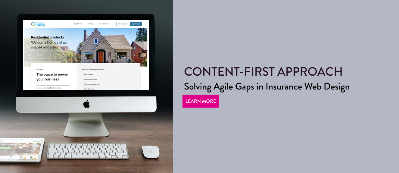
AMIG
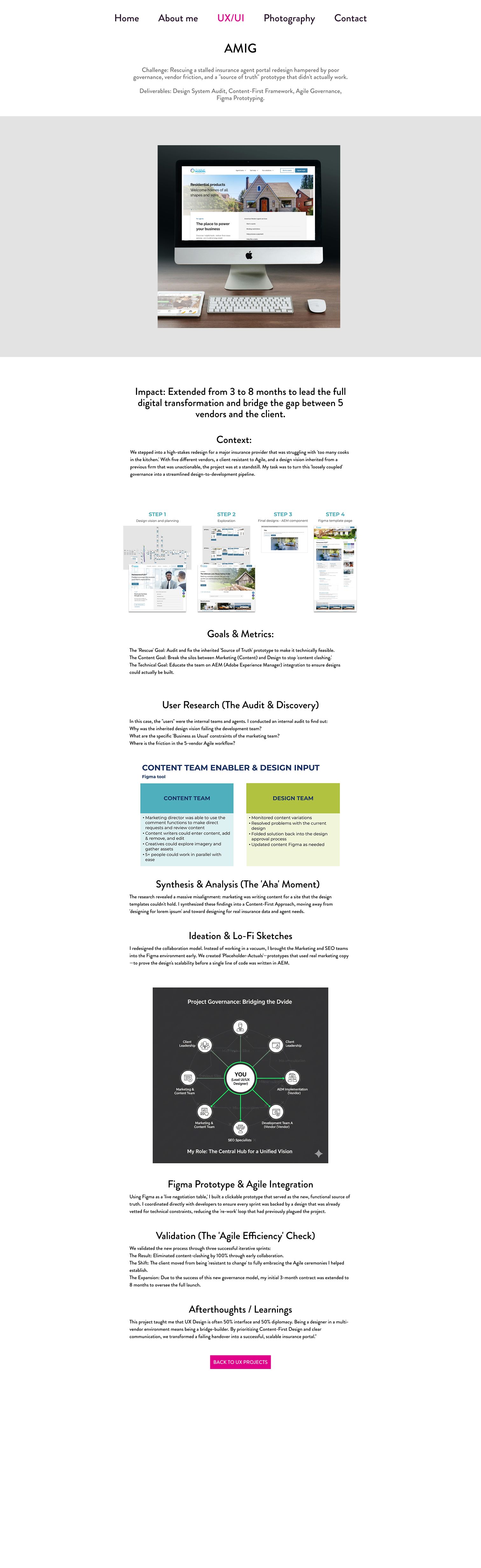
Rescuing a stalled insurance agent portal redesign hampered by poor governance, vendor friction, and a "source of truth" prototype that didn't actually work.
Deliverables: Design System Audit, Content-First Framework, Agile Governance, Figma Prototyping.
Context:
We stepped into a high-stakes redesign for a major insurance provider that was struggling with 'too many cooks in the kitchen.' With five different vendors, a client resistant to Agile, and a design vision inherited from a previous firm that was unactionable, the project was at a standstill. My task was to turn this 'loosely coupled' governance into a streamlined design-to-development pipeline.
Goals & Metrics:
- The 'Rescue' Goal: Audit and fix the inherited 'Source of Truth' prototype to make it technically feasible.
- The Content Goal: Break the silos between Marketing (Content) and Design to stop 'content clashing.'
- The Technical Goal: Educate the team on AEM (Adobe Experience Manager) integration to ensure designs could actually be built.
User Research (The Audit & Discovery)
In this case, the 'users' were the internal teams and agents. I conducted an internal audit to find out:
- Why was the inherited design vision failing the development team?
- What are the specific 'Business as Usual' constraints of the marketing team?
- Where is the friction in the 5-vendor Agile workflow?
Synthesis & Analysis (The 'Aha' Moment)
The research revealed a massive misalignment: marketing was writing content for a site that the design templates couldn't hold. I synthesized these findings into a Content-First Approach, moving away from 'designing for lorem ipsum' and toward designing for real insurance data and agent needs.
Ideation & Lo-Fi Sketches
I redesigned the collaboration model. Instead of working in a vacuum, I brought the Marketing and SEO teams into the Figma environment early. We created 'Placeholder-Actuals'—prototypes that used real marketing copy—to prove the design's scalability before a single line of code was written in AEM.
Figma Prototype & Agile Integration
Using Figma as a 'live negotiation table,' I built a clickable prototype that served as the new, functional source of truth. I coordinated directly with developers to ensure every sprint was backed by a design that was already vetted for technical constraints, reducing the 're-work' loop that had previously plagued the project.
Validation (The 'Agile Efficiency' Check)
We validated the new process through three successful iterative sprints:
- The Result: Eliminated content-clashing by 100% through early collaboration.
- The Shift: The client moved from being 'resistant to change' to fully embracing the Agile ceremonies I helped establish.
- The Expansion: Due to the success of this new governance model, my initial 3-month contract was extended to 8 months to oversee the full launch.
Afterthoughts / Learnings
This project taught me that UX Design is often 50% interface and 50% diplomacy. Being a designer in a multi-vendor environment means being a bridge-builder. By prioritizing Content-First Design and clear communication, we transformed a failing handover into a successful, scalable insurance portal.
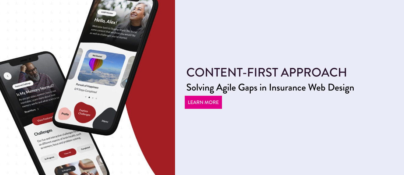
AARP
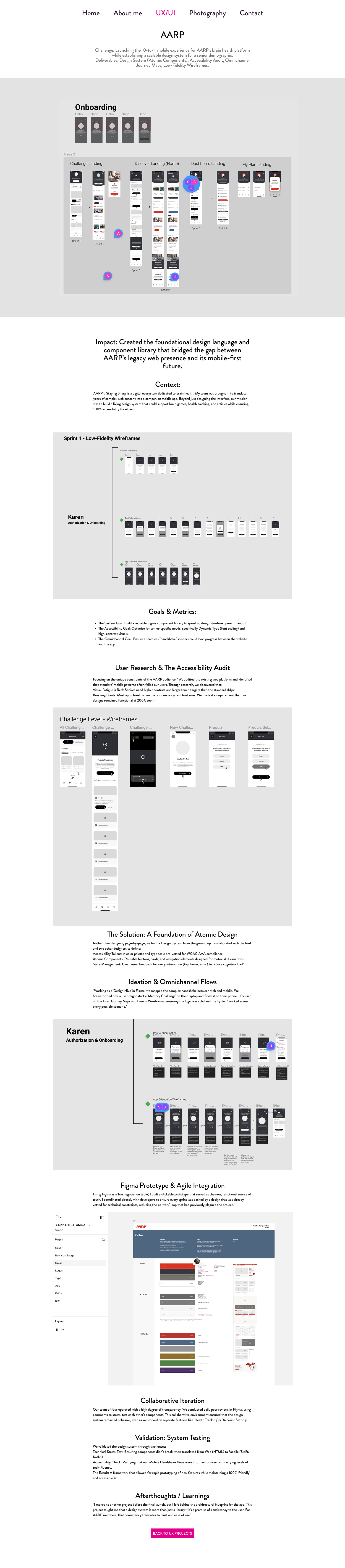
Launching the "0-to-1" mobile experience for AARP's brain health platform while establishing a scalable design system for a senior demographic.
Deliverables: Design System (Atomic Components), Accessibility Audit, Omnichannel Journey Maps, Low-Fidelity Wireframes.
Context:
AARP's 'Staying Sharp' is a digital ecosystem dedicated to brain health. My team was brought in to translate years of complex web content into a companion mobile app. Beyond just designing the interface, our mission was to build a living design system that could support brain games, health tracking, and articles while ensuring 100% accessibility for elders.
Goals & Metrics:
- The System Goal: Build a reusable Figma component library to speed up design-to-development handoff.
- The Accessibility Goal: Optimize for senior-specific needs, specifically Dynamic Type (font scaling) and high-contrast visuals.
- The Omnichannel Goal: Ensure a seamless 'handshake' so users could sync progress between the website and the app.
User Research & The Accessibility Audit
Focusing on the unique constraints of the AARP audience. We audited the existing web platform and identified that standard mobile patterns often failed our users. Through research, we discovered that:
- Visual Fatigue is Real: Seniors need higher contrast and larger touch targets than the standard 44px.
- Breaking Points: Most apps 'break' when users increase system font sizes. We made it a requirement that our designs remained functional at 200% zoom.
The Solution: A Foundation of Atomic Design
Rather than designing page-by-page, we built a Design System from the ground up. I collaborated with the lead and two other designers to define:
- Accessibility Tokens: A color palette and type scale pre-vetted for WCAG AAA compliance.
- Atomic Components: Reusable buttons, cards, and navigation elements designed for motor-skill variations.
- State Management: Clear visual feedback for every interaction (tap, hover, error) to reduce cognitive load.
Ideation & Omnichannel Flows
Working as a 'Design Hive' in Figma, we mapped the complex handshake between web and mobile. We brainstormed how a user might start a 'Memory Challenge' on their laptop and finish it on their phone. I focused on the User Journey Maps and Low-Fi Wireframes, ensuring the logic was solid and the 'system' worked across every possible scenario.
Figma Prototype & Agile Integration
Using Figma as a live negotiation table, I built a clickable prototype that served as the new, functional source of truth. I coordinated directly with developers to ensure every sprint was backed by a design that was already vetted for technical constraints, reducing the 're-work' loop that had previously plagued the project.
Collaborative Iteration
Our team of four operated with a high degree of transparency. We conducted daily peer reviews in Figma, using comments to stress-test each other's components. This collaborative environment ensured that the design system remained cohesive, even as we worked on separate features like 'Health Tracking' or 'Account Settings.'
Validation: System Testing
We validated the design system through two lenses:
- Technical Stress-Test: Ensuring components didn't break when translated from Web (HTML) to Mobile (Swift/Kotlin).
- Accessibility Check: Verifying that our 'Mobile Handshake' flows were intuitive for users with varying levels of tech-fluency.
- The Result: A framework that allowed for rapid prototyping of new features while maintaining a 100% 'friendly' and accessible UI.
Afterthoughts / Learnings
I moved to another project before the final launch, but I left behind the architectural blueprint for the app. This project taught me that a design system is more than just a library—it's a promise of consistency to the user. For AARP members, that consistency translates to trust and ease of use.
Designing the visual experience of your brand. Because a great product deserves a great story.
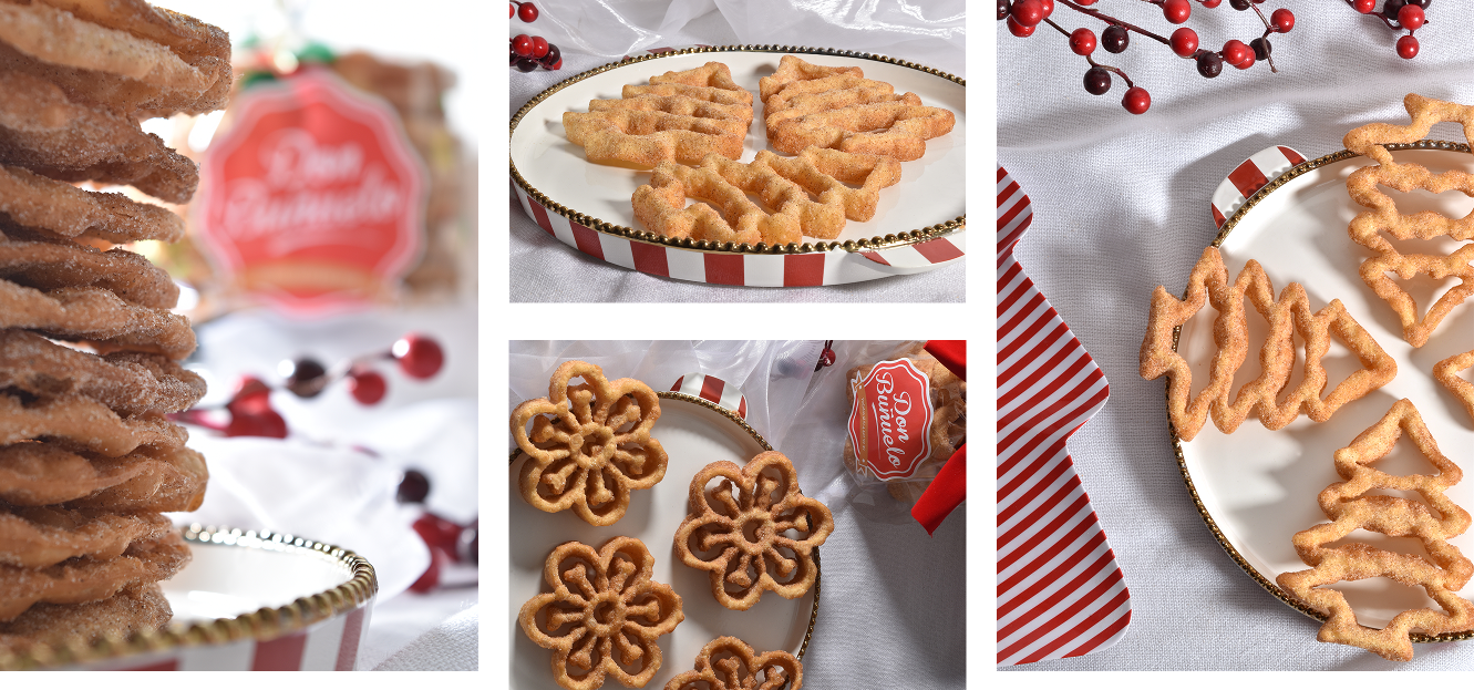
Capturing the textures, the details, and the 'I-have-to-have-that' feeling.
"I spent years studying the way objects are built, the way they feel in the hand, and the problems they solve. As an Industrial Designer, I learned to see the soul in the details, the curve of a shadow, the grain of a texture, the precision of a seam. Now, I bring that same design-thinking to my lens. I don't just 'take pictures' of products; I document their craftsmanship. My style is a mix of technical rigor and visual storytelling, ensuring your product doesn't just look good, it looks intentional."
REQUEST A QUOTE